
Last week, I considered several different options for the dining room walls, including different patterns (harlequin, stripes, two neutral colors, white-on-white with different sheens), so I put it up for a vote. The vote was overwhelmingly for a solid neutral color.
Initially, I wasn’t thrilled with the vote. The two neutrals I’ve used throughout our house are Behr Polar Bear (a creamy white) and Benjamin Moore Classic Gray (a really light warm gray). The dining room has been painted solid Classic Gray for years, and I really liked it. But now that I’m trying to create a really colorful dining room, the Classic Gray just didn’t work for me anymore. Even though it looks really light and bright in the living room, it always looked darker in this dining room.
But if you’ve been around for a while, and you stuck with me through my failed attempt at turning the front living room into a dining room, you also know that I learned the hard way that I don’t like white walls. I like white on trim and wainscoting, but I like the walls to have a contrast with the trim and wainscoting. It doesn’t need to be a huge contrast, though. It just has to be enough for the eye to perceive that the trim and the walls are two different colors.
So I decided to test out the idea of mixing my own paint using 50% Polar Bear and 50% Classic Gray just to see what that would look like. And what I ended up with is my new absolute favorite neutral wall color. First, let me remind you what the Classic Gray walls looked like…
You can see that it is definitely not a dark color. It’s barely gray. And yet, with the new direction of the dining room, it looked a little too dark and muddy to me. But this new 50/50 mixture is just perfect.
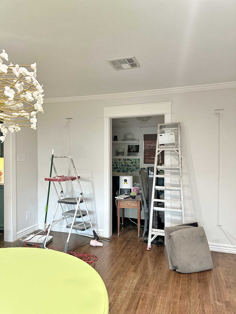
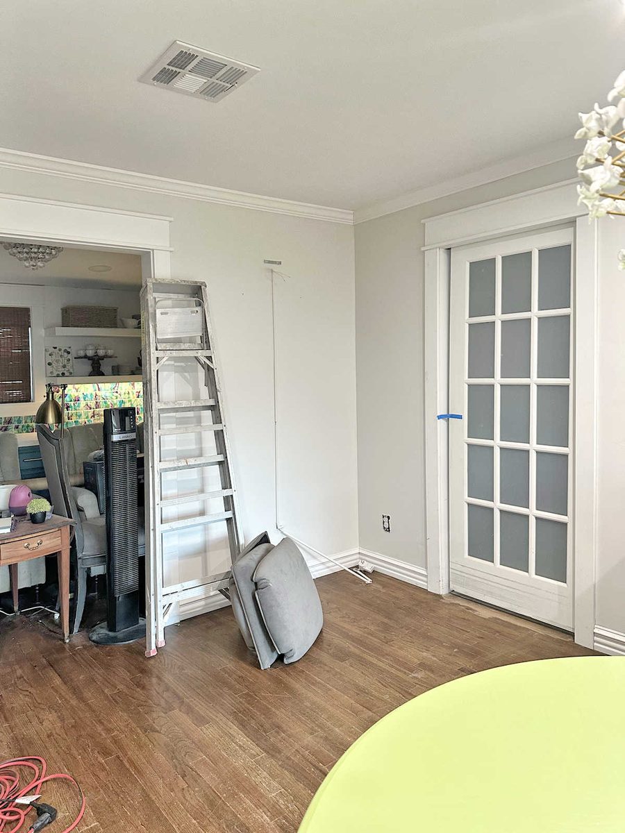
There’s just enough contrast there so that you can see a difference between the trim color and the wall color, and yet, the walls don’t look gray at all. They look light and bright and ready to serve as a background for some colorful artwork and fabrics.
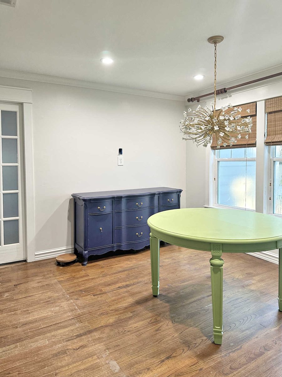
I genuinely couldn’t be more thrilled with how this looks. Initially, I felt like I was settling by choosing to go with the majority vote for a solid neutral wall color in here. But after they were painted and completely dry, I thought it was the perfect background for lots of color.
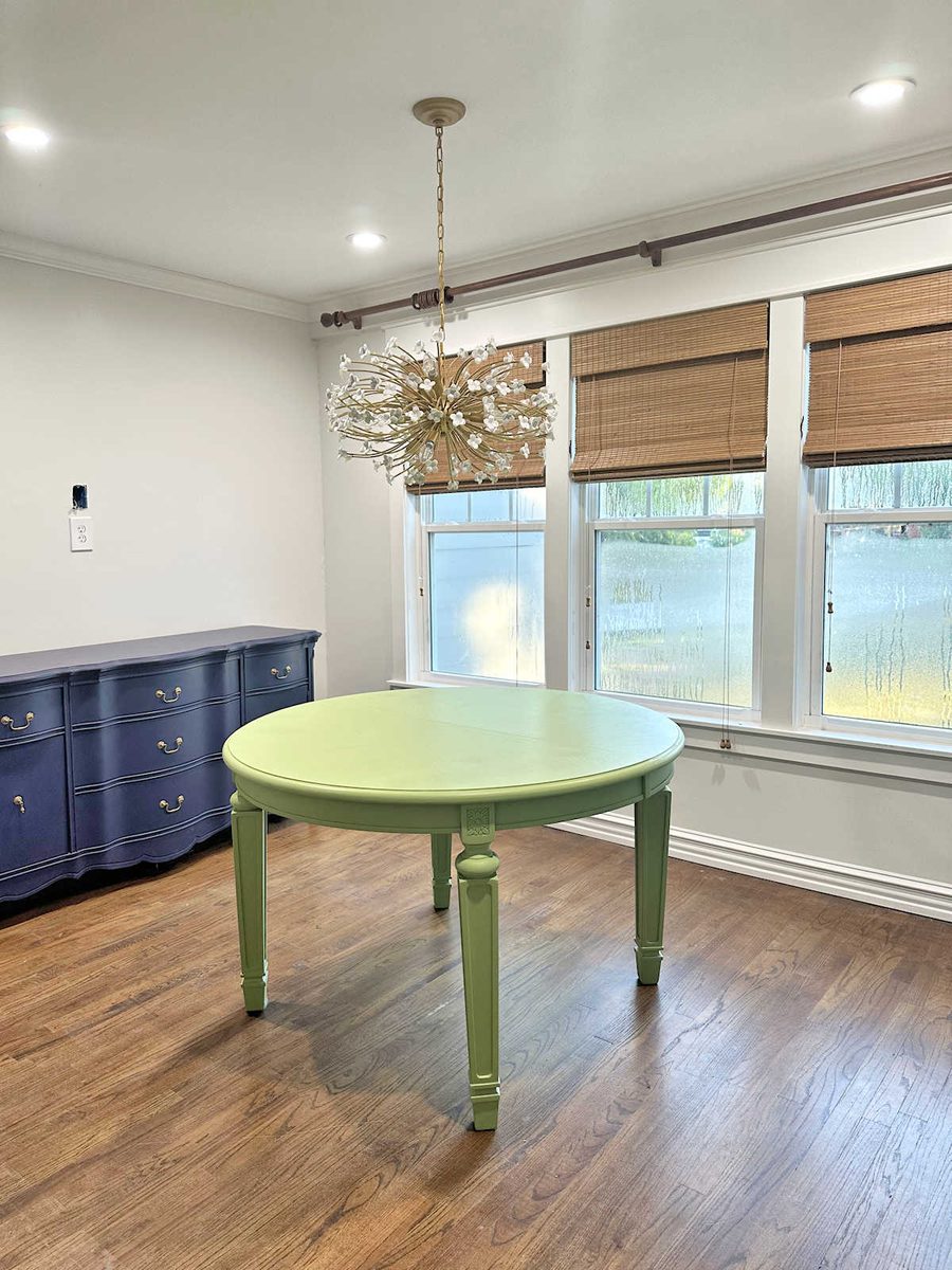
I realized that the whole reason I was leaning towards a pattern in the first place was because I don’t like solid white walls, but I also didn’t want the solid Classic Gray walls, either. The walls needed to be lighter and brighter in here, so my mind immediately went to one of the only two ways I could think of to add more brightness to the walls. And that was with a pattern that included white. The other obvious option was white wainscoting, but I already have enough wainscoting in the house, and there’s not enough wall space in here to bother with wainscoting. Mixing the two colors together was the perfect solution, and it goes beautifully with the other rooms.
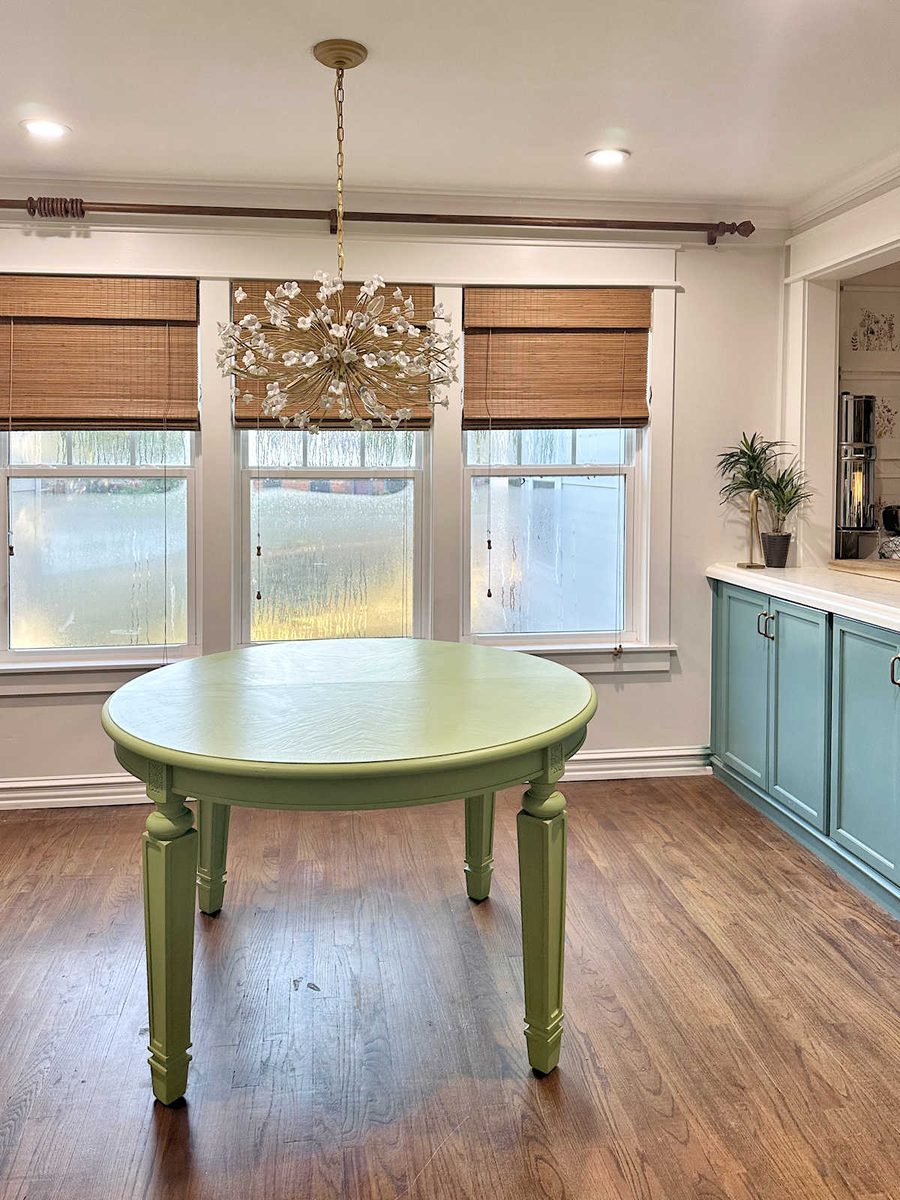
On another note, I got the rug out of the room, which was a big job because it was taped down on one edge with rug tape. I’m still struggling to get the residue off of the floor. But I love how this room looks without a rug! I haven’t seen this floor without a rug in years, and removing the rug immediately made the room look and feel larger.
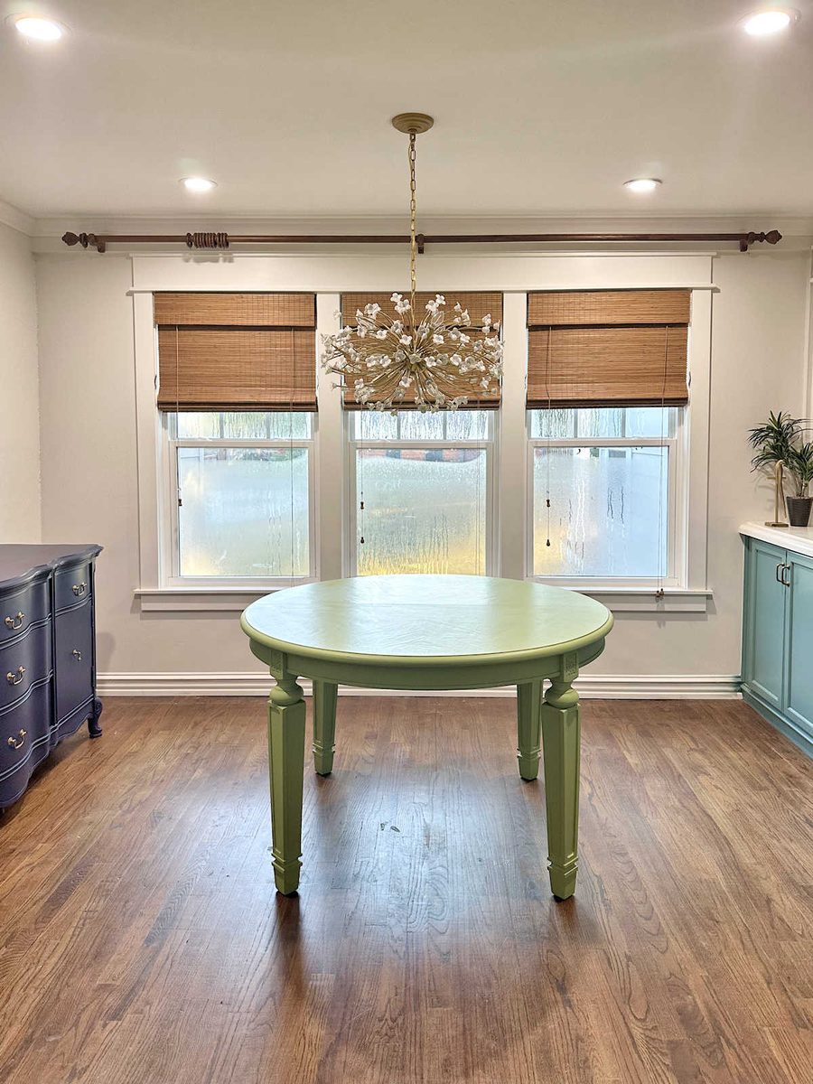
I still have a long way to go to get this room finished, and now that the walls are finished, I’m really excited to start bringing in the color.
More About Our Breakfast Room
see all breakfast
room diy projects
read all breakfast
room blog posts

Addicted 2 Decorating is where I share my DIY and decorating journey as I remodel and decorate the 1948 fixer upper that my husband, Matt, and I bought in 2013. Matt has M.S. and is unable to do physical work, so I do the majority of the work on the house by myself. You can learn more about me here.
