
Before I get to the final dining room table paint color that I selected, I want to stare that I’ve decided to finish the dining room completely before I start work on the storage room again. Last week, I was planning on painting the dining table and then turning my attention to the storage room. And then once the storage room was finished, then I’d return to the dining room and finish with that room. The reason I changed my mind is because the storage room being in disarray really has no impact on our day-to-day lives. That room, as well as the mess associated with it being unfinished, sits behind closed doors. The dining room, on the other hand, is in a very “public” area of our home and is part of a main traffic area through our house. Now that I’ve started on it, I don’t want to leave it unfinished. I need to get it finished and get my work area cleaned up ASAP. Anyway, I just wanted to let y’all know what to expect over the next couple of weeks.
Now let’s move on to the dining table paint color. When I showed y’all the dining table makeover progress on Friday, I had started painting the table with Sherwin Williams Stay In Lime.
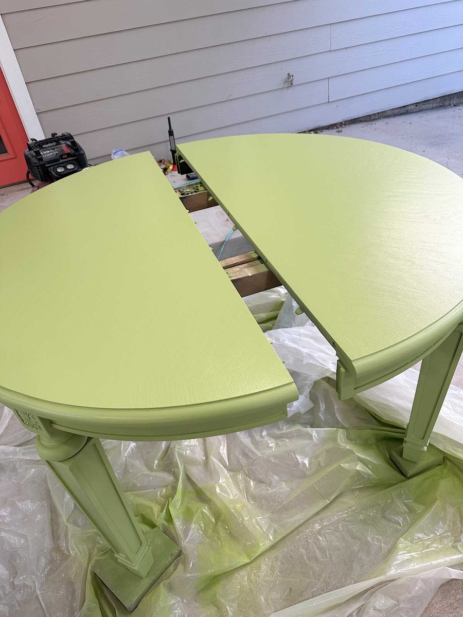
I went ahead and painted the whole table that color, and when it was dry, I decided that it was just too much. It’s going to have bold reddish pink dining chairs sitting up against it, and in my mind, the really bold green and the really bold reddish pink would compete with each other. One of those colors needed to be toned down, and it wasn’t going to be the pink.
As a reminder, this is ChatGPT mockup that I’m using as my inspiration for the final look…
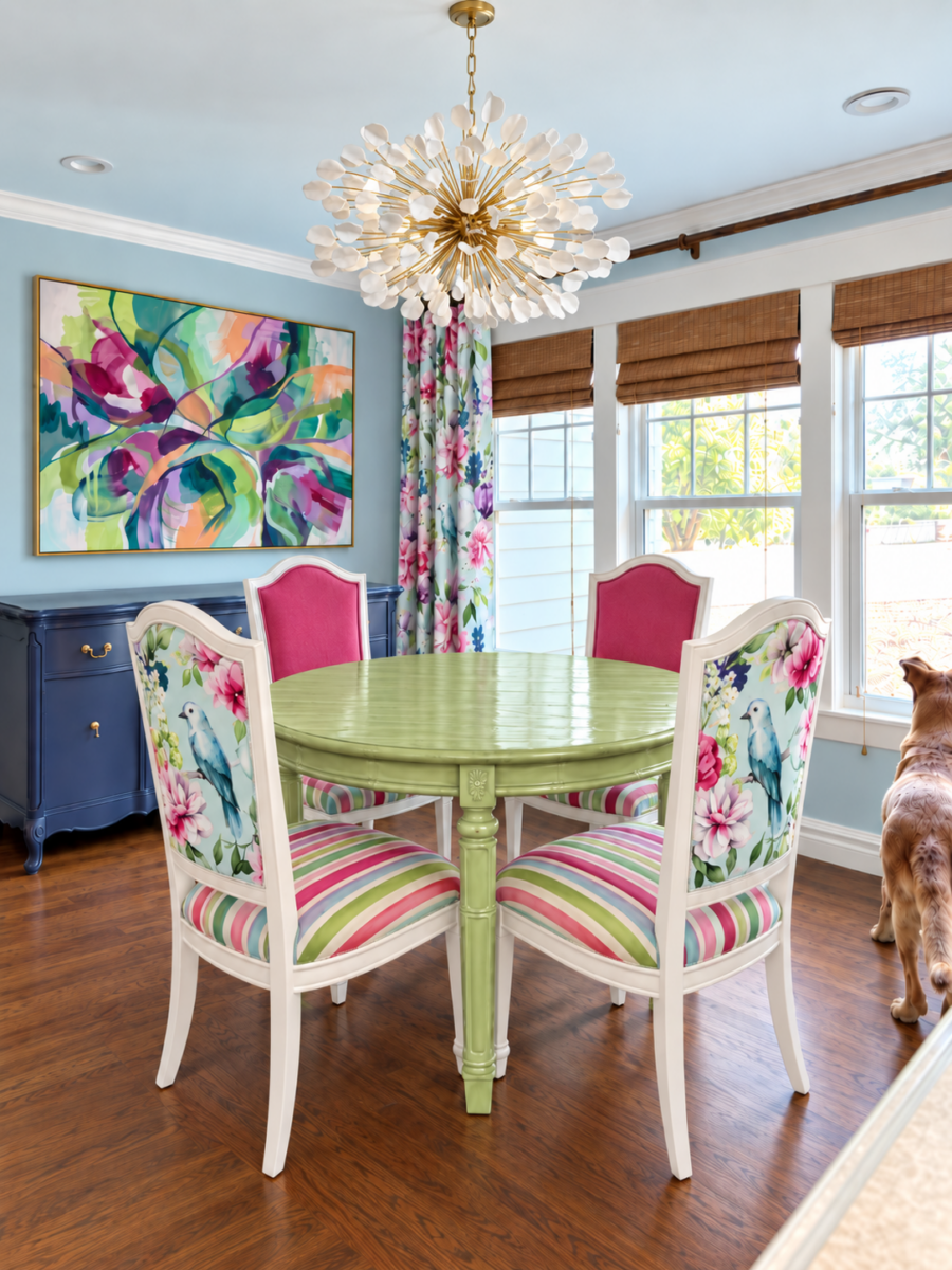
So on Saturday, I headed back to Sherwin Williams to purchase the green paint that was one shade lighter than the Stay In Lime color I had used. That color is called Lime Rickey. But when the woman who was helping me mixed the color, she said that Lime Rickey mixed in the paint she had available “has a delta of three.” Those were her exact words. I didn’t know what that meant, but I could certainly see the difference with my eyes. The Lime Rickey paint swatch was brighter and clearer, but the mixed paint looked duller. When she showed me, my immediate reaction was, “Oh, that looks kind of muddy, doesn’t it?”
Unfortunately (or maybe fortunately), they didn’t have the base that was needed in order for the mixed paint color to look exactly like the paint swatch, but when I showed her my ChatGPT mockup, she encouraged me to take it home and try it. She said I could bring it back for a refund if it didn’t work.
So that’s what I did. And quite honestly, when got the base and then half of the top painted with the new paint color, I was convinced that it wouldn’t work. Here are the two colors side-by-side, but this was taken when the new color on the left was still wet.
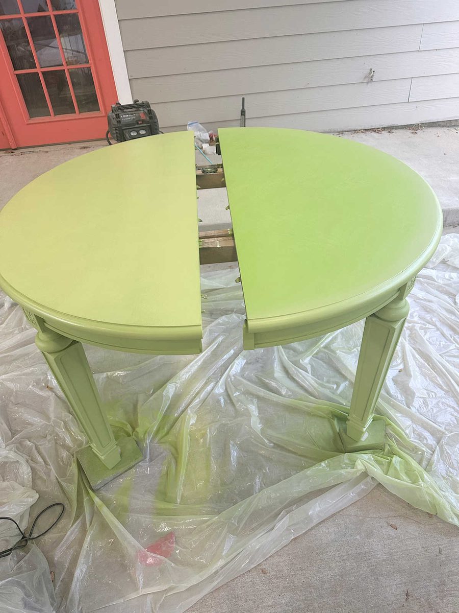
Initially, it looked too yellow to me, but as it dried, a lot of that yellow went away and the final color was greener. But I was still unsure about the color.
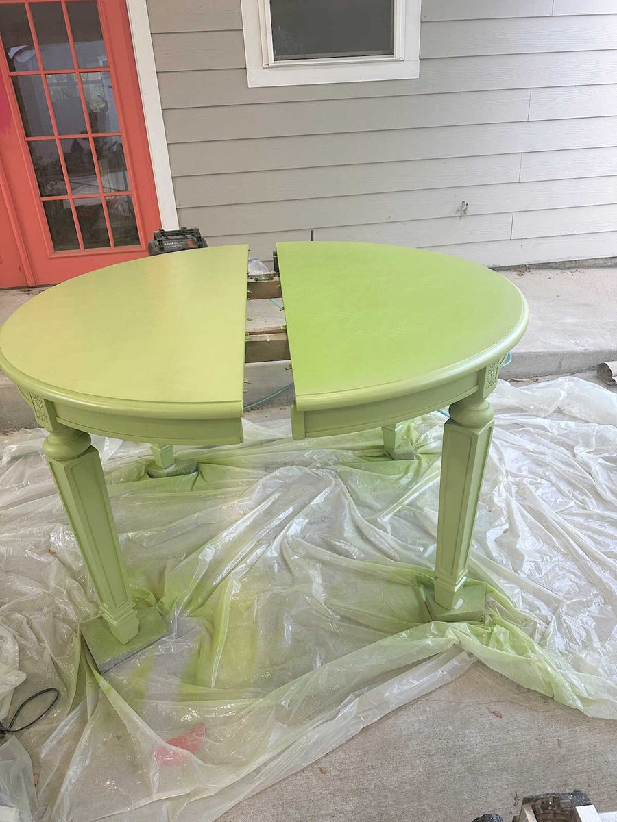
But I decided to press on, let it dry completely, and look at it on its own without being compared to that original color. And in the end, I absolutely loved the color!
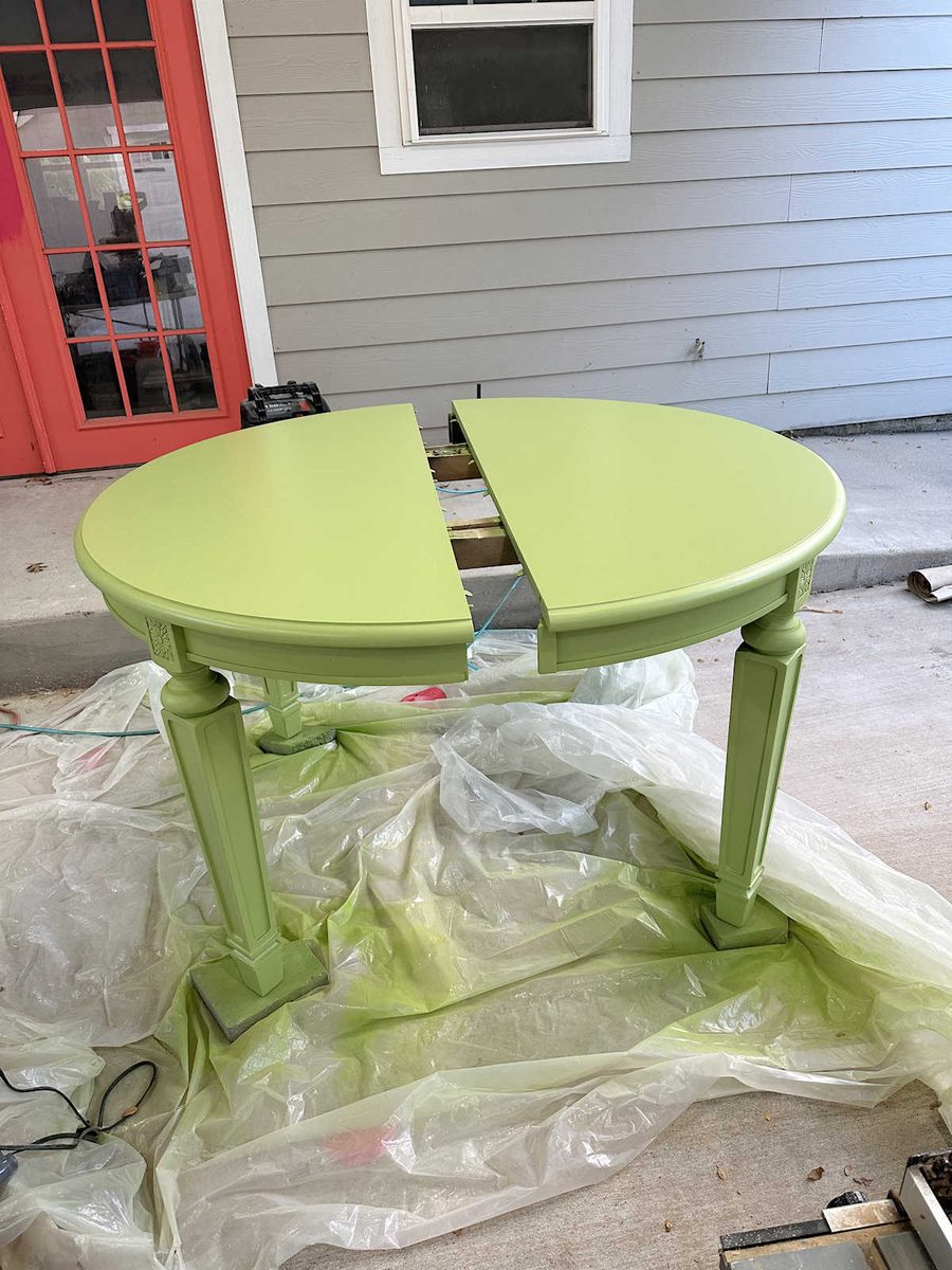
I painted everything except the very top with my favorite paint sprayer, and then I painted the top with a 6-inch roller for smooth surfaces.
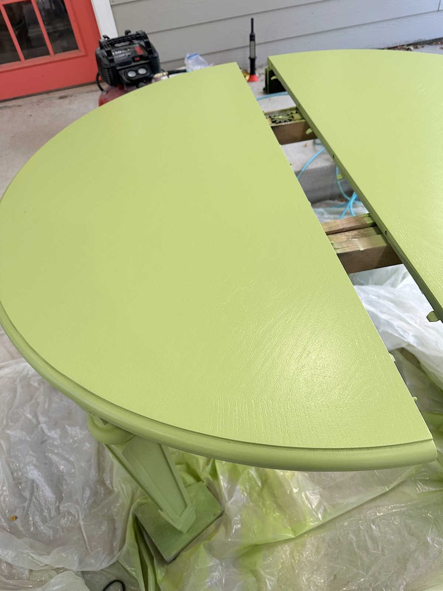
I’m still going to put a clear coat on it, but I had to order it online and it hasn’t been delivered yet. That’s why the table is still outside and not sitting in the dining room. I want to spray the clear coat, and I don’t want to have to move inside and then back outside to spray it again. So it’ll be outside for a few more days before we can see what it looks like in the room.
So what does “a delta of three” actually look like? Here’s a comparison of the Lime Rickey paint swatch and the Lime Rickey paint color mixed in a quart of Lime Rickey mixed in deep base Emerald paint with a satin finish.
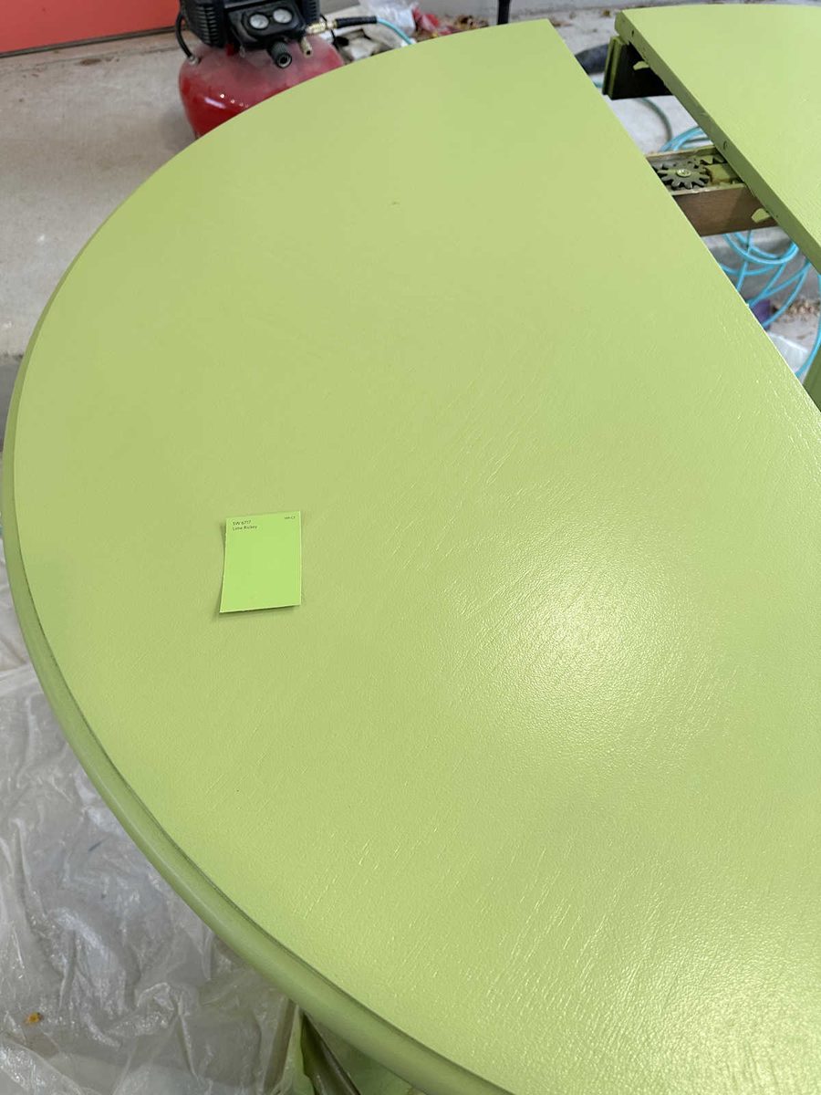
It’s quite a difference! But I also think the “muddy” color goes better in my house.
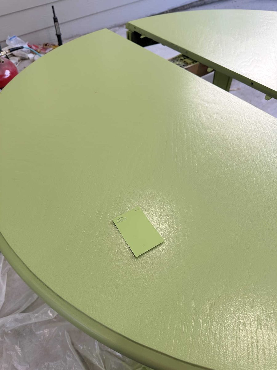
The table is still going to look bright and colorful in the finished room without it looking neon.
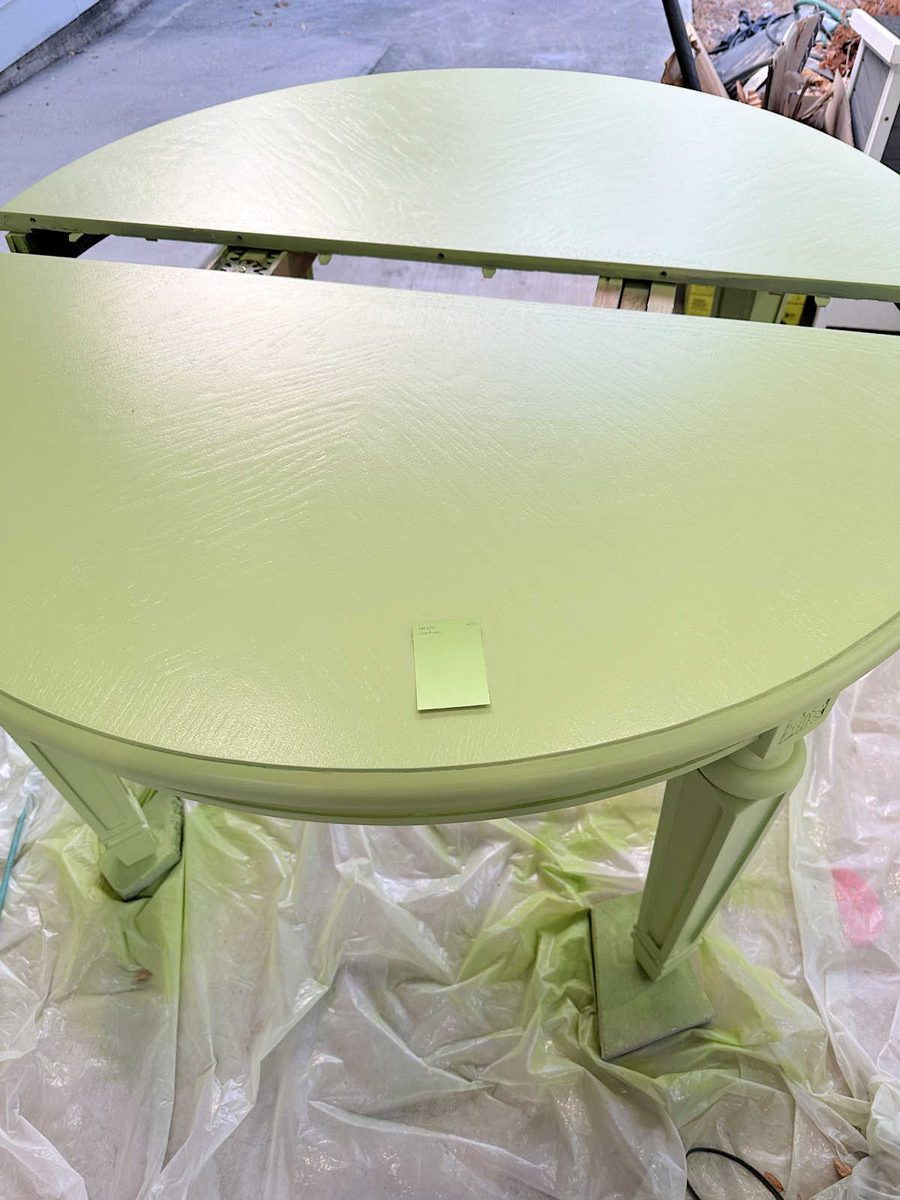
So in the end, I’m happy that it couldn’t be mixed to match the paint swatch. I think this “delta of three” produced a fresh, bright green that will look much more cohesive with the other colors in our house.
While I was there, I also spent quite a bit of time trying to find a wall color that would work. In the mockup, I used a really light blue-green wall color. But in reality, there was no such color that would work. I had taken one of the kitchen cabinet doors as well as the drapery fabric. And no matter how many paint swatches I tried, there wasn’t a single color that would bridge the background color on the fabric with the kitchen cabinet paint color. They were all either too green to blend with the fabric or too blue to coordinate with the kitchen cabinets.
I did purchase two samples. The one on the left is called Rain, which I had mixed at 50%. Then I decided to try a really light green to see if that would work. That one is called Honeydew.
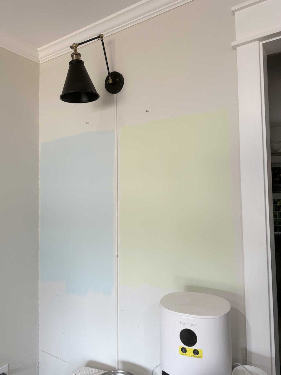
I ruled out the green immediately. That’s just not me. But the blue, even though it’s described as a blue with a hint of green, was too blue to coordinate with my kitchen cabinets, just as I suspected. So I tried mixing some of the green in with the Rain color, and then I painted the bottom right quadrant of the blue sample with that color. I don’t know if you can tell the difference, but I can see it in person. It was definitely better, but still not great.
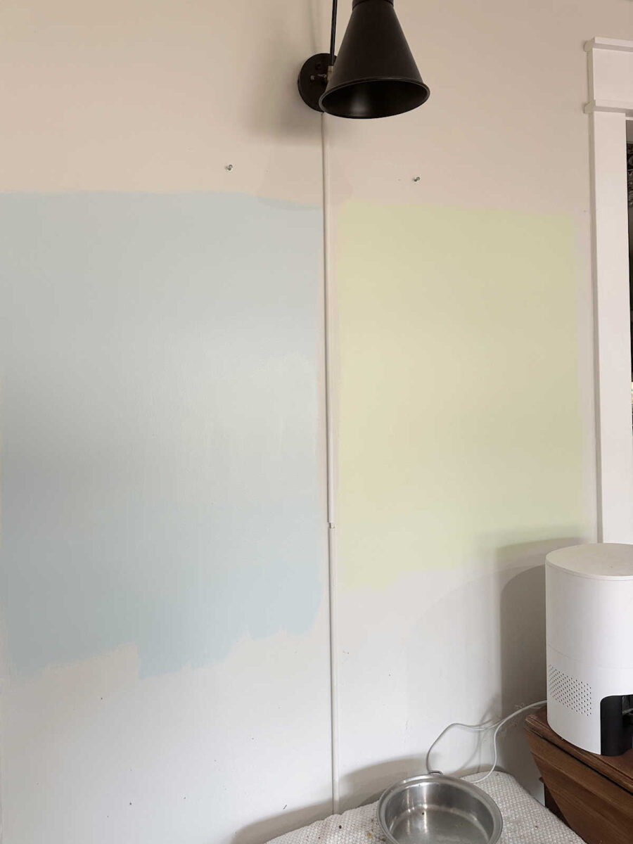
I also painted the right half of this blue sample with the newly mixed color. Again, it was better, but I still didn’t like it with the kitchen cabinets.
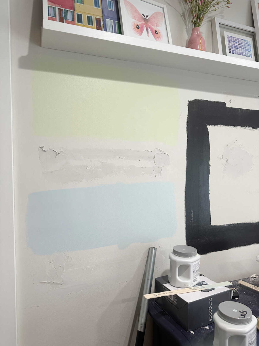
And here are both samples — the Honeydew (green) on top and the Rain at 50% with a bit of Honeydew mixed in on the bottom.
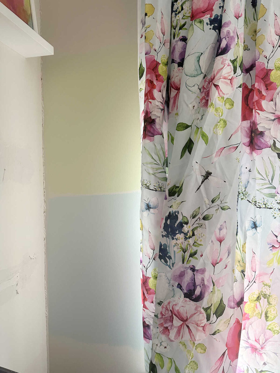
The bottom color looks great with the drapery fabric, but I ruled it out because it doesn’t look great with the kitchen cabinets. It’s a very pretty color, though!
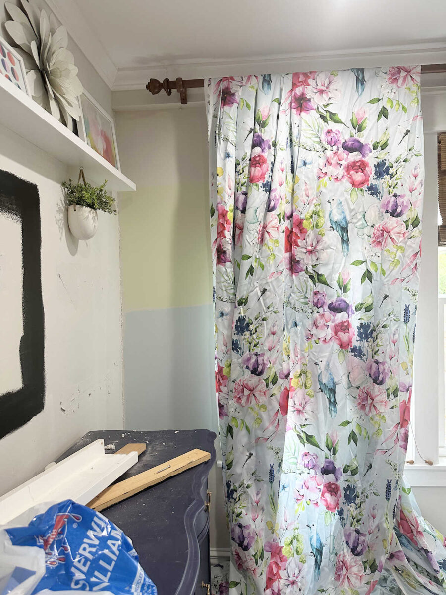
When it comes to the walls, I think the main issue I’m running into is that in the rest of the “public” rooms of our house, they all have neutral walls. The living room has Classic Gray walls. The music room has Classic Gray and Polar Bear walls. The kitchen has white tiled walls. My studio has Classic Gray walls. Behr Polar Bear and Benjamin Moore Classic Gray are the two colors that carry throughout all of those areas and make them look cohesive. The color comes in on furniture, fabrics, cabinets, etc. So I really don’t love the idea of breaking up that continuity by putting a color on the walls in the dining room.
So I’ve come up with a different idea for the dining room. It won’t have solid neutral walls, but I also won’t be breaking up that continuity that I have right now by putting a color on the walls. I’ve decided to add a pattern, but just like the music room, the pattern will be in the two neutrals that carry throughout the rest of the rooms. I’m still working out the details in my mind, but thankfully, there’s not much wall space in the dining room, so I’m hopeful that it won’t be a really time-consuming project.

Addicted 2 Decorating is where I share my DIY and decorating journey as I remodel and decorate the 1948 fixer upper that my husband, Matt, and I bought in 2013. Matt has M.S. and is unable to do physical work, so I do the majority of the work on the house by myself. You can learn more about me here.
